
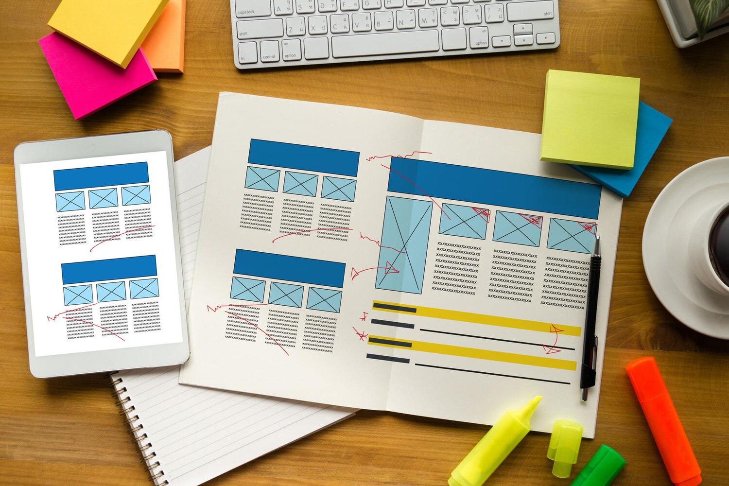
Elementor Grid Containers give you a structured way to arrange page content in rows and columns. Instead of treating every section as a single horizontal or vertical flow, you can define a grid-based layout and place elements into its cells. This makes the feature useful for sections that depend on consistent alignment, repeated columns or a clearly divided visual structure.
This guide explains how to create an Elementor Grid Container, what a grid cell can contain, how nested containers solve multi-element layouts and which settings influence spacing, sizing, placement and alignment. It also compares Grid with Flexbox and outlines practical checks for responsive layouts. The documented editor behavior is separated from recommendations about when a particular layout approach may be appropriate.
What an Elementor Grid Container Is
An Elementor Grid Container is a container organized around symmetrical rows and columns. Its cells provide defined positions for content, making the layout suitable for structured multi-column sections. The selected arrangement establishes the basic grid, while the Layout settings let you refine how rows, columns and their contents behave.
Grid is not automatically the right choice for every section. A grid-based layout should be evaluated against the content structure, reading order and behavior required at different responsive breakpoints. A visually neat arrangement still needs to remain usable when the page is viewed on smaller screens.
Grid and Flexbox in Practical Terms
In practical terms, Grid is a useful option when content benefits from a symmetrical row-and-column structure. This can include a complex multi-column area in which several elements need consistent placement. Elementor’s documentation contrasts this with Flexbox arrangements, which are generally more directional or asymmetrical and may suit content that primarily follows a row or column flow.
Use this distinction as guidance rather than as a universal rule. Before choosing a container type, consider how the content is grouped, how it should flow on smaller screens and whether the visual order supports the intended reading order. The final choice should be tested rather than assumed.
How to Create Your First Grid Container
Creating a Grid Container starts directly in the Elementor Editor. The initial layout is selected from the page canvas, after which widgets can be assigned to the available cells. Treat the predefined arrangement as a starting structure, not as proof that the finished responsive layout is complete.
The Initial Editor Workflow
- Open the relevant page in the Elementor Editor.
- Select the plus sign on the canvas.
- Choose Grid from the available container choices.
- Select a grid layout option, such as a predefined row-and-column arrangement.
- Add widgets to the available cells.
- Review the arrangement before refining its layout settings.
Once the basic structure exists, inspect the content placement at the desktop, tablet and mobile breakpoints. The selected arrangement determines the starting positions, but the resulting presentation also depends on sizing, gaps, autoflow, alignment and the content placed in each cell.
Understanding Grid Cells and Their Limitation
A Grid Container cell can contain one element directly. For example, that direct element may be a Text Editor widget or an Image widget. This is an important planning constraint: a cell does not directly accept several separate widgets at the same time.
If a design requires a heading, text and image to function as a group inside one area, the group needs its own container. That container becomes the single direct element in the parent cell. The widgets are then placed inside the nested container, where they can be arranged independently.
Planning Content Around One Direct Element
Use a single widget when the cell represents one complete content element. This keeps the relationship between the cell and its content clear. When the cell represents a more complex group, plan for a nested container before adding individual widgets.
- Single-content cell: use one direct widget when the cell needs one text or image element.
- Grouped content: use a container when several widgets must occupy the same conceptual area.
- Responsive review: check that the visual grouping still supports the intended reading flow on smaller screens.
The exact appearance and sizing depend on the selected grid arrangement and subsequent settings. Visual grouping should not be treated as proof that the resulting order is automatically the most useful one.
Using Nested Containers for Multi-Element Cells
A nested container solves the one-element-per-cell limitation by acting as the single element placed in the parent grid cell. It then provides an internal layout area for several widgets. This allows a parent grid to define the main page structure while a child container controls the arrangement of grouped content.
For example, a parent cell can contain a nested container, and that nested container can hold several text and image widgets. If the internal arrangement needs its own rows and columns, the child container can be changed from Flexbox to Grid and configured separately. The parent and child therefore have distinct layout responsibilities.
Building an Internal Grid Inside a Cell
- Place a container inside the target parent grid cell.
- Treat the nested container as the cell’s one direct element.
- Add the required widgets inside the nested container.
- Change the child container to Grid when its internal content needs a row-and-column arrangement.
- Configure the child container’s layout independently from the parent grid.
This approach is useful for grouped text, images or card content, but nesting should be deliberate. Before adding another container, confirm that the current parent-child relationship reflects the content structure. Also test the result at relevant breakpoints and check whether the visual arrangement preserves a sensible reading order.
Responsive Grid Configuration
After creating the grid and placing content, review the settings that control its structure and spacing. Grid Container layout options include row and column sizing, gaps, autoflow, justification and alignment. These controls determine how the available cells and their contents are arranged, but no single setting guarantees an optimal result on every screen.
Sizing, Gaps and Alignment
Start by reviewing row and column sizing against the intended structure. If the columns do not provide the expected proportions or the rows do not accommodate their content, adjust the relevant sizing options. Then check the gaps between grid items. Gaps control separation at the grid level, while individual widget margins may also affect the visible spacing.
Justification and alignment are important when content appears displaced within its available area. Check these controls at the parent container and, where applicable, at nested containers. A child’s position can reflect settings inherited from or applied by its parent, so changing individual widget spacing is not always the first diagnostic step.
Autoflow and Responsive Review
Autoflow controls whether widgets are placed by row or by column. Choose the direction that matches the intended placement order, then review the result at each relevant breakpoint. A row-based arrangement may produce a different visual sequence from a column-based arrangement when the available space changes.
Do not rely only on the editor’s initial desktop view. Compare desktop, tablet and mobile presentations, and confirm that the visual order remains consistent with the content hierarchy. Also check keyboard flow, heading structure, contrast, touch usability and mobile presentation. Responsive behavior needs to be evaluated as part of the page structure, not treated as an automatic result of selecting Grid.
Grid Container vs Flexbox: Which Should You Choose?
Choose a Grid Container when the section benefits from a structured, symmetrical arrangement of rows and columns. Elementor’s guidance presents Grid as particularly useful for complex, automatically responsive multi-column layouts and neatly divided structures. This makes it a practical consideration for content that needs consistent placement across several columns.
Consider Flexbox when the layout is primarily directional or asymmetrical. A section that follows a clear row or column flow may not need the two-dimensional structure of Grid. The choice should depend on the content hierarchy, responsive behavior and maintainability required by that particular section.
A Practical Selection Checklist
- Ask whether the content naturally forms a symmetrical row-and-column structure.
- Consider whether the arrangement is mainly directional or asymmetrical.
- Review how the content should flow at tablet and mobile breakpoints.
- Check whether the visual order supports the intended reading sequence.
- Test the selected approach before applying the same structure to other sections.
Grid and Flexbox are layout options, not universal requirements. A recommendation based on the shape of the content should be confirmed by inspecting the finished page at its relevant breakpoints.
Troubleshooting Grid Layout Problems
Grid problems often appear as misplaced content, unexpected spacing or a child container that does not respond as expected. These issues should be investigated through the relationship between parent and child settings rather than by changing many controls at once. A focused review makes it easier to identify which setting affects the result.
Parent Alignment and Child Positioning
When content appears incorrectly positioned, first inspect the parent container’s alignment settings. Review justification as well, because parent-level controls can affect the position of child content. If the cell contains a nested container, check that child’s layout settings after reviewing the parent.
Make one meaningful adjustment at a time and then inspect the result at the relevant breakpoints. Avoid assuming that a widget itself is responsible for every positioning issue. The interaction between the parent grid, the nested container and the widget can all influence what appears on the page.
Gaps, Margins and Final Breakpoint Checks
Inconsistent spacing can result from the relationship between grid gaps and individual widget margins. Compare both before removing or adding spacing values. A gap applied to the grid and a margin applied to a widget may combine visually, so changing only one of them may not produce the expected result.
After correcting alignment or spacing, recheck desktop, tablet and mobile presentations. For a production-critical page, test substantial changes on a staging site or after a backup, particularly when changing several nested containers. Do not assume that removing containers, changing gaps or choosing a specific setting guarantees a measurable performance improvement without page-specific testing.
Elementor Grid Containers provide a practical structure for pages that need symmetrical rows and columns. To begin, open the page in the Elementor Editor, select the plus sign, choose Grid and select a layout arrangement. Plan around the rule that one element can be placed directly in each cell, using a nested container when several widgets must be grouped together. Refine row and column sizing, gaps, autoflow, justification and alignment, then test the result across responsive breakpoints. Grid may suit structured multi-column content, while Flexbox may be more appropriate for directional or asymmetrical sections. Always verify reading order, usability and spacing instead of assuming the selected layout is automatically optimal. Explore our WordPress plugins, WooCommerce extensions, themes and membership plans to find the right tools for your website.